Layout: Carousel#
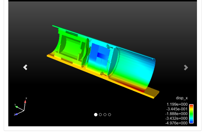
The carousel presents the data items passed in a panel with controls to pan from data item to data item. The most common usage is as an image 'carousel'. The user can move from item to item with arrow controls or directly with slide dots. Furthermore, the items can be dynamically animated. Any data item type can be presented in the carousel layout. An example (that includes slide dots) might look like this:

Configuration options#
The carousel layout has two options. By default, the content can only be moved by clicking on the right and left arrows. If 'Animated' is checked, the display will advance without any user interaction. The other option is to include slide dots along the bottom of the item. Clicking on these dots causes the display to jump to the specific data item. Note: if there is not enough space for all of the slide dots, none will be displayed, even if the option is selected.
