Layout: Panel#
The panel layout is similar to the column layout except that it draws a more formal boundary around its children that can be styled in different ways. It also allows the user to specify that instead of including the HTML for an item inline, that a link be displayed instead that the user can click on to see the item.
Configuration options#
There are two options specific to this layout:
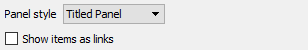
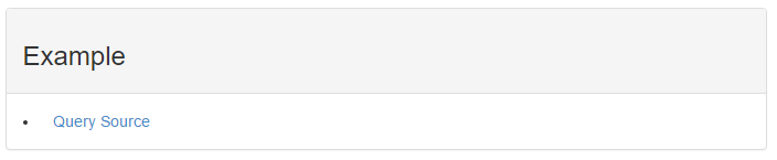
The panel styles include the following. Note, the 'Show items as links' option has been selected and the Custom HTML Header has been set to '<h3>Example</h3>' in these examples.
Titled panel#
Callout panel#
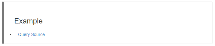
The other callout panels differ in the color of the bar on the left side of the callout. The 'Error' case will be red. The ' Warning' case will be orange-yellow. The 'Success' case is green and the 'Info' case is blue.
The "Show items as links" will place a URL link in the report that can be used to display the actual data item content instead of placing the content in-line.
Properties#
Property |
Value |
||||||
|---|---|---|---|---|---|---|---|
items_as_links |
|
||||||
panel_template_toggle |
|