Data Item: Table#
This data item contains a 2D array of elements arranged as rows and columns. These elements can be single or double precision floating point values or fixed length strings.
Display options#
The table item can be displayed as a physical table as text with optional column sorting or as an interactive plot. In plot mode, line, bar, scatter and pie charts are all supported. The value of the 'plot' property controls the specific type of display that will be generated. There are a number of properties supported for all tables: labels, titles, formatting, etc, documented in the table at the end of this section.
Table View#
A table data item displayed as a table might look like this:
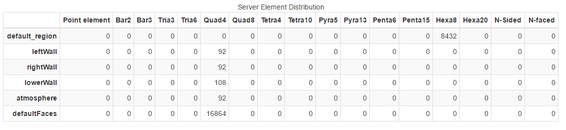
Tables have optional row and column headers that are presented as bold-face labels along the top and left sides of the table. Each table has an optional title that is displayed, centered, over the top of the table. Columns support sorting and clicking on individual columns will sort the rows according to the order of the values in that column. Values in the table can be strings or floating point numbers. The 'format' property sets the default formatting for the entire table or for individual columns. Of special note, a table value can be interpreted as a time value (the number of seconds since 1970-01-01T00.00:00.00000). In conjunction with the 'date_XY' formatting option, these can be displayed in proper date/time formats.
Line Plot View#
The table example may be displayed as a line plot.
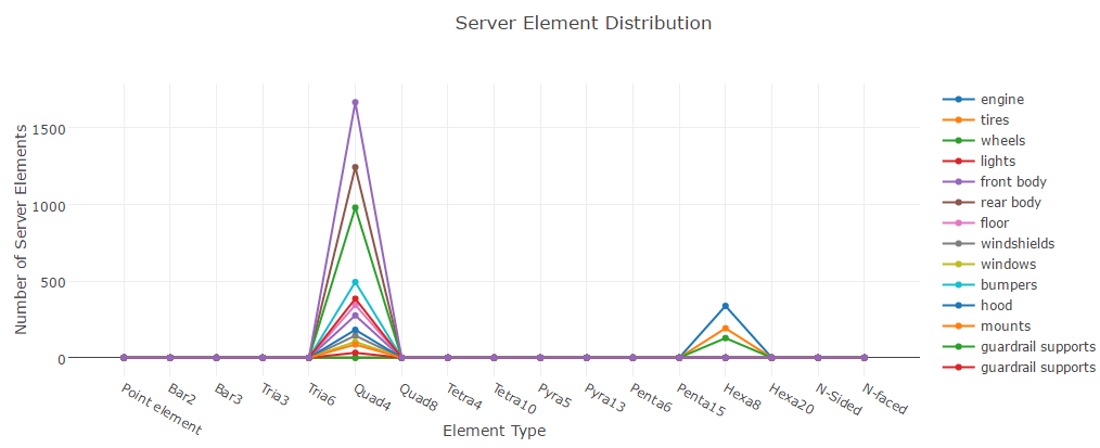
In line plot mode, rows in the table are mapped to lines in the line plot. A specific row or the column labels can be used as the common X axis for the data in each row. NaN values in the row are not included in any plots (they are simply skipped). Line colors, widths, styles, thicknesses and symbols can all be controlled via properties. A line plot with symbols but with the 'line_style' of none results in a scatter plot.
Bar Graph View#
The table example may be displayed as a bar graph.
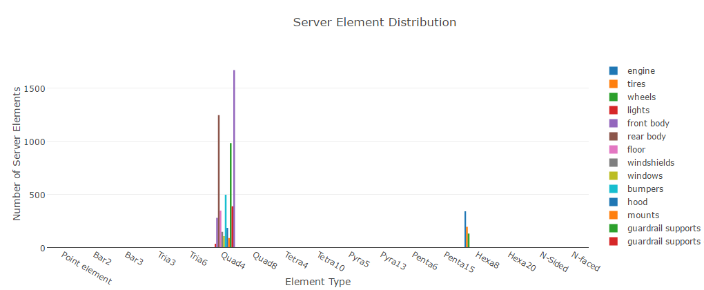
In bar plot mode, rows in the table are mapped to sets of bars in the bar plot. A specific row or the column labels can be used as the common X axis for the data in each row. NaN values in the row are not included in any plots (they are simply skipped). Bar plots map the 'line_color' property to the color of each bar set.
Pie Chart View#
The table example may be displayed as a pie chart.
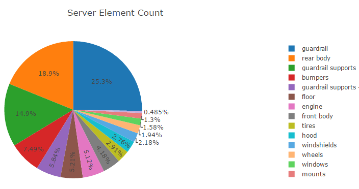
In pie chart mode, each row is displayed as a separate pie graph with a common legend. The colors of the pie wedges can be set using the 'line_color' property. The row label and the specific wedge value can be seen when the mouse points at an individual wedge.
Heatmap View#
A 2D array of values can be displayed graphically as blocks colored by a palette. This is generally referred to as a "heatmap" display. Consider a table of values that might look like this:
0.00291 |
0.01306 |
0.02153 |
0.01306 |
0.00291 |
0.01306 |
0.05854 |
0.09653 |
0.05854 |
0.01306 |
0.02153 |
0.09653 |
nan |
0.09653 |
0.02153 |
0.01306 |
0.05854 |
0.09653 |
0.05854 |
0.01306 |
0.00291 |
0.01306 |
0.02153 |
0.01306 |
0.00291 |
If the plot property is set to 'heatmap', the table will be displayed
like this:
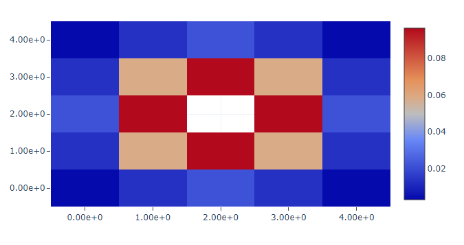
The nan value is interpreted as a missing value. Grid lines can be
added to the display using the show_border property. The format,
palette, palette_reverse, palette_show and palette_range
properties are all supported.
Parallel Coordinates Plot View#
In a parallel coordinates plot, each row in the table is considered an observation. Each column in the table is a different observation. Consider a table of five observations. Each observation consists of three values: Width, Height and Value:
Width |
Height |
Value |
|---|---|---|
54.2 |
12.3 |
1.45e5 |
72.3 |
9.3 |
4.34e5 |
45.4 |
10.8 |
8.45e4 |
67.4 |
12.2 |
2.56e5 |
44.8 |
13.5 |
9.87e4 |
If the plot property is set to 'parallel', the table will be displayed
like this:
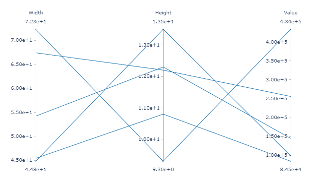
One axis for each of the columns in the table with one line for each
row in the table. The minimum and maximum values for each column
can be set using the column_minimum and column_maximum
properties. The format and line_color properties are honored
by parallel coordinates plots.
Sankey Diagram View#
A sankey diagram is a nodal flow diagram. It draws a plot of linked nodes, where each link has a specific weight or 'value'. Links are directional, in that the flow from node A to node B is displayed separately from the flow from node B to A, and they can have different weights. Weights must be non-zero, positive floating point numbers.
The nodal network is represented as a table. The rows and columns are the nodes. Rows are the "sources" and columns are the "targets". The value in the table is the weight of the link from the source to the target. Weights that are less than or equal to 0.0 are non-existent links and are not included in the sankey diagram.
Note
Labels for the nodes are assumed to be the same for the sources and targets. The column labels are used as the node labels, any supplied row labels are ignored.
Consider a graph with 6 nodes: A, B, C, D, E, F. Nodes A and B feed C and D while nodes C and D feed E and F with the following weights:
Source |
Target |
Weight |
|---|---|---|
A |
C |
8 |
B |
D |
4 |
A |
D |
2 |
C |
E |
8 |
D |
E |
5 |
D |
F |
1 |
That graph is represented using this table (which is passed to ADR):
A |
B |
C |
D |
E |
F |
|
|---|---|---|---|---|---|---|
A |
0 |
0 |
8 |
2 |
0 |
0 |
B |
0 |
0 |
0 |
4 |
0 |
0 |
C |
0 |
0 |
0 |
0 |
8 |
0 |
D |
0 |
0 |
0 |
0 |
5 |
1 |
E |
0 |
0 |
0 |
0 |
0 |
0 |
F |
0 |
0 |
0 |
0 |
0 |
0 |
If the plot property is set to 'sankey', the above table will be
displayed like this:
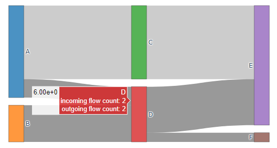
The format property is honored by sankey plots.
LaTeX Support in Plots#
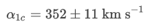
Most table properties that support text for display (e.g. plot_title, ytitle, etc) also support the use of LaTeX styling for the creation of math formulas. If the table item is displayed as a table, use the general LaTeX syntax. If the LaTeX is part of a chart (pie, line, bar, etc), the syntax is a little different. The plotter LaTeX syntax is fairly simple, wrap the Latex text with '$' characters. For example, a plot_title property with the value:
:math:`\\alpha\_{1c} = 352 \\pm 11 \\text{ km s}\^{-1}`
will be displayed in the plot like this:
Properties#
Properties can be scalars or lists. Multiple rows can be used as y values for plot lines in the same plot, selected by the yaxis property. The value of that property can be a row name or the row index into the table (if a number). The xaxis property provides matching row names providing x values for each yaxis row. Other properties can provide values for each y row as well. These can be scalars (used for all nodes of all row lines) or arrays. If arrays, individual values in the array are used for each y axis line. If the value is simple value, it is used for all nodes in the line (e.g. #ff0000 used as a color). If the value is prefixed with an '@' character, it is interpreted as a row reference. A row reference can be either the index number of a row or the name of a row. For example when used with line_marker_size: '@0' selects the first row (row at index 0), '@Temperature' selects the row with the name 'Temperature', while '0' specifies the value 0.0.
Note: for items listed as arrays or scalars, an array may be used to specify a specific value for each instance in a plot or if a single value is specified, it will be used for all instances. Most such properties specify things like the color of a trace on a chart or the name of the marker to be used with each trace.
Property |
Value |
||||||||||||||||||||||||||||||||||||||
|---|---|---|---|---|---|---|---|---|---|---|---|---|---|---|---|---|---|---|---|---|---|---|---|---|---|---|---|---|---|---|---|---|---|---|---|---|---|---|---|
align_column |
Controls the justification of the text in the columns. Example: [right, left, center]. If the number of columns is less than the number of justifications you have set, the sequence will repeat itself. |
||||||||||||||||||||||||||||||||||||||
column_minimum |
For a parallel coordinates plot, specify the minimum value for the range of each axis. An array of float values, for example: [0., 1e-10, -2.5]. |
||||||||||||||||||||||||||||||||||||||
column_maximum |
For a parallel coordinates plot, specify the maximum value for the range of each axis. An array of float values, for example: [100., 2e-10, -1.0]. |
||||||||||||||||||||||||||||||||||||||
format |
formatting for values in a table or plot. It may be an array or a scalar (e.g. scientific or [scientific, date_00]). Valid values include
|
||||||||||||||||||||||||||||||||||||||
height |
Height of the chart in pixels |
||||||||||||||||||||||||||||||||||||||
item_justification |
Controls the justification of tables in reports and detail pages. Overrides report-wide justification. Can be left, center or right. By default, there will be no justification. |
||||||||||||||||||||||||||||||||||||||
labels_column |
An array of strings to use as column labels. Example: [column A, column B] |
||||||||||||||||||||||||||||||||||||||
labels_row |
An array of strings to use as row labels. Example: [row 1, row 2] |
||||||||||||||||||||||||||||||||||||||
legend_position |
If a legend is shown, this property can be used to position the legend relative to the plot. For example, the value: [1.0, 0.5] will place the legends to the right of the plot, centered vertically while [0.0, 0.0] will place it in the lower left corner of the plot. The numbers are [X,Y] and the domain of the plot is from 0,0 to 1,1. Numbers above and below 0,1 are legal. |
||||||||||||||||||||||||||||||||||||||
line_color |
Color of the plot line, set of bars or pie arc segments. For example #ff0000 is red. It may be an array or scalar ([#808080,#ff0000,#00ffff] or #8f4f55) color or an array of row references. If a row reference is specified, the values in the row are mapper through the palette and palette_range to select the color. |
||||||||||||||||||||||||||||||||||||||
line_error_bars |
This property can be set to a single value, an array of values or an array of row references. A vertical error bar is drawn centered on each marker location. The length of the error bars is selected using this property. |
||||||||||||||||||||||||||||||||||||||
line_marker |
The name of the marker to use. This may be an array or a scalar. There are a number of supported markers
The suffix -open can be added to specify that a filled marker be drawn only in outline and -dot can be added to specify a dot be drawn in the center of the marker. The marker specification: square-open-dot will result in the outline of a square drawn with a dot in the center. |
||||||||||||||||||||||||||||||||||||||
line_marker_auxX |
'X' can have the value [0-9], for example 'line_marker_aux0'. This property specifies up to 10 "auxiliary" values. The formatting is the same as line_marker_size and it declares extra values that can be accessed in the line_marker_text strings as "v/auxX". |
||||||||||||||||||||||||||||||||||||||
line_marker_opacity |
The opacity of the marker from [0.0, 1.0]. May be an array, scalar or row reference. The default opacity is 1.0. |
||||||||||||||||||||||||||||||||||||||
line_marker_scale |
If the line marker is specified as a row, this property is used to apply a linear transform to the value before it is used as the marker size. It takes the form [M,B] and the transform is: final_size = M*input_size + B. The default is [1.0,0.0]. |
||||||||||||||||||||||||||||||||||||||
line_marker_size |
The size of the marker in points. May be an array, scalar or row reference. If a row reference is specified, the values in the row are used as the size of the individual markers after mapping the values through the line_marker_scale transform. |
||||||||||||||||||||||||||||||||||||||
line_marker_text |
If set, the value of this property is used to generate the strings that are displayed at a marker when the mouse hovers over a marker. The string may include multiple macros. An example might be: '({{v/x}},{{v/y}}) {{v/rowname}} color={{v/color}} size={{v/size}} error={{v/error}}' Any property in the current context can be used in the string as well as several properties specific to this specific marker. The specific properties include
|
||||||||||||||||||||||||||||||||||||||
line_style |
Selects the dashed line form. May be an array or a scalar.
|
||||||||||||||||||||||||||||||||||||||
line_width |
Width of the plot line in pixels. May be an array or a scalar (e.g. [1,3,3] or 1) |
||||||||||||||||||||||||||||||||||||||
marker_text_rowname |
If the row for a given data value has a name, then by default, that name will be appended to any marker text generated for hover display. If this property is set to 0, then the row name will never be appended and if set to 1, it will always be appended. |
||||||||||||||||||||||||||||||||||||||
nan_display |
In the table format, the value displayed to represent a NaN value. The default is 'NaN'. |
||||||||||||||||||||||||||||||||||||||
palette |
Set to the name of a palette to use when line_colors is used to select marker colors by values. The valid palette names are: Greys, YlGnBu, Greens, YlOrRd, Bluered, RdBu, Reds, Blues, Picnic, Rainbow, Portland, Jet, Hot, Blackbody, Earth, Electric and Viridis. If a '-' is placed before the name, the palette order will be reversed. |
||||||||||||||||||||||||||||||||||||||
palette_position |
If a color palette has been selected and set to be shown, this property can be used to position the center of the palette colorbar relative to the plot. For example, the value: [1.2, 0.5] will place the colorbar to the right of the plot while [-0.2, 0.5] will place it to the left of the plot. The numbers are [X,Y] and the domain of the plot is from 0,0 to 1,1. Numbers above and below 0,1 are legal. |
||||||||||||||||||||||||||||||||||||||
palette_range |
This property is used to set the range of the palette color mapping. It takes the form [min,max]. The color value min will be mapped to the lowest color in the palette and max to the highest color in the palette. |
||||||||||||||||||||||||||||||||||||||
palette_show |
This property can have the value 1 or 0. The colorbar will be added to the plot if the value is 1 and hidden if 0. If 'palette' is specified, this value will default to 1. |
||||||||||||||||||||||||||||||||||||||
palette_title |
This property can be used to display a text title for the colorbar. |
||||||||||||||||||||||||||||||||||||||
plot |
Change the display mode for the table item. Select between the various plots.
|
||||||||||||||||||||||||||||||||||||||
plot_margins |
This property allows for the adjustment of the amount of spacing between the plot border (not including axis tick labels or titles) and the boundaries of its container. It can be used to provide more space for axis tick labels or to expand the plot to make more effective use of whitespace (e.g. when the legend is hidden). It takes the form: [{left},{top},{right},{bottom}] where each of the four values is an integer number of pixels to use as the margin along the left, top, right and bottom of the plot respectively. The value: default can be used to leave a value set to its natural value. For example, the value: [default,default,5,default] can be used to make the right side of the plot more close follow the right side of the plot container. |
||||||||||||||||||||||||||||||||||||||
plot_title |
The title for the table if displayed as a chart |
||||||||||||||||||||||||||||||||||||||
plot_xaxis_type |
linear=linear mapping, log=log mapping for the x axis |
||||||||||||||||||||||||||||||||||||||
plot_yaxis_type |
linear=linear mapping, log=log mapping for the y axis |
||||||||||||||||||||||||||||||||||||||
stacked |
1=display multiple data values in 'bar' chart mode as stacked bars |
||||||||||||||||||||||||||||||||||||||
show_border |
If this property is 1, the plot will have a border drawn around it. If 0, no border is drawn. The default is 0. |
||||||||||||||||||||||||||||||||||||||
show_legend |
If this property is 1, the plot legend will be displayed. If 0, it is hidden. The default is 1. |
||||||||||||||||||||||||||||||||||||||
show_legend_border |
If this property is 1, a border will be drawn around the plot legend. If 0, it is hidden. The default is 0. |
||||||||||||||||||||||||||||||||||||||
table_cond_format |
This property sets the conditional formatting for the cells. See conditional formatting for additional details. |
||||||||||||||||||||||||||||||||||||||
table_page |
This property controls the number of rows that are visible in each page of the table. Default is 0, which turns the table pagination off. Any number larger than 1 sets the number of rows for each page. If the property is set to 1, the default value of 10 rows per page is used. |
||||||||||||||||||||||||||||||||||||||
table_pagemenu |
This property controls the options displayed in the 'Show' field: how many rows are visible for each page. Example: [10, 100, 500] will display only these three values as options. The default is [10, 25, 50, 100, -1], where -1 stands for "All". |
||||||||||||||||||||||||||||||||||||||
table_scrollx |
If this property is 0, there is no horizontal scroll bar for the table. Default is 1, which displays the horizontal scroll bar |
||||||||||||||||||||||||||||||||||||||
table_scrolly |
This property controls the vertical scroll bar. The value of this property is the height of the table that will be visible in points (1 point = 1/72 inch). Default is 0, or no scroll bar |
||||||||||||||||||||||||||||||||||||||
table_search |
If this property is 1, the Search field will appear to allow user to search inside the table values. The default is 0. |
||||||||||||||||||||||||||||||||||||||
table_sort |
This property controls the ability of the able to be interactively sorted. Possible values include
|
||||||||||||||||||||||||||||||||||||||
table_title |
Title for the table if displayed as a table |
||||||||||||||||||||||||||||||||||||||
table_bordered |
If this property is 0, the table's border will be removed. The default is 1. |
||||||||||||||||||||||||||||||||||||||
table_condensed |
If this property is 1, the table's horizontal and vertical height will be minimized making it look compact. The default is 0. If both table_condensed and table_wrap_content are set to 1, condensation is ignored. This is because if you turn on wrapping, the text flows to the next row and it will lose the condensed look when that happens. |
||||||||||||||||||||||||||||||||||||||
table_wrap_content |
If this property is 1, it will enable wrapping of content to the next line inside a table cell. Default is 0. Table headers i.e. column labels and row labels will not wrap because the label/header should determine the wrapping point of the rest of the rows. Only the content in the body of the table will wrap. |
||||||||||||||||||||||||||||||||||||||
table_default_col_labels |
Enable/disable default column labels. If set to 0, it disables the addition of default column labels. The default is 1. |
||||||||||||||||||||||||||||||||||||||
title |
Title used if plot_title or table_title is not specified |
||||||||||||||||||||||||||||||||||||||
width |
Width of the chart in pixels |
||||||||||||||||||||||||||||||||||||||
xaxis |
Row number(s) or name(s) to be used as the x axes values for 'line' charts. This can be a single value or an array of row references. |
||||||||||||||||||||||||||||||||||||||
xaxis_format |
If set, this formatting string will be used (instead of the one specified by the 'format' property) to format the tick values of the x axis. |
||||||||||||||||||||||||||||||||||||||
xrange |
The minimum and maximum values for the x axis. Example: [0.0, 10.0] |
||||||||||||||||||||||||||||||||||||||
xtitle |
Title to be used for the chart x axis. |
||||||||||||||||||||||||||||||||||||||
yaxis |
Row number(s) or name(s) to be used as the y axes values for charts. This can be a single value or an array of row references. If no value is specified, all rows not specified in the xaxis property will be used as yaxis rows. |
||||||||||||||||||||||||||||||||||||||
yaxis_format |
If set, this formatting string will be used (instead of the one specified by the 'format' property) to format the tick values of the y axis. |
||||||||||||||||||||||||||||||||||||||
yrange |
The minimum and maximum values for the y axis. Example: [0.0, 10.0] |
||||||||||||||||||||||||||||||||||||||
ytitle |
Title to be used for the chart y axis. |
Table Conditional Formatting#
The property is a conditional formatting string. The target portion of a rule is based on row and column labels. If those labels are not defined for a table, the row/column index (zero-based) can be used to select the portion of the table the rule applies to.
Gallery Examples#
This section will show in detail how to reproduce the plot and table example from the Ansys Dynamic Reporting gallery.
Plot 1: Overlapping Profiles#
How to create a plot that shows the air flow profile on top of the Force pressure profile?
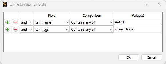
The first step is to isolate the data items that contain the data point. In the template item filter, enter the conditions to isolate those items. For example:
Once you have isolated the tables, you will need to merge them into a single item. Select in the Template type: Table Merge Generator. Enter in the Configure data item merge... menu to make sure the merging configurations are set to the default ones. Make sure also that in the Generated items you have Replace instead of the default Append. If you now generate your report, you should see something like this:
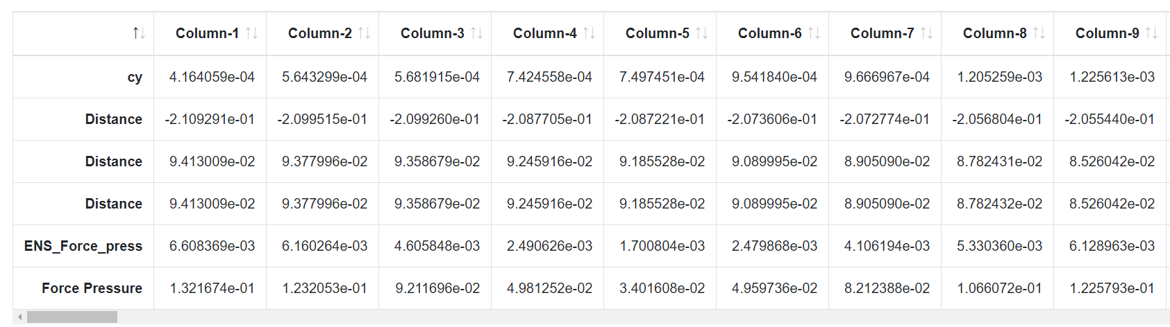
In this particular example, we are merging three tables. See how we have three times a "Distance" row: this is because each table had "Distance" as the x axis.
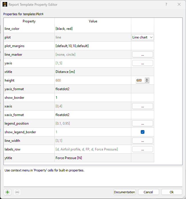
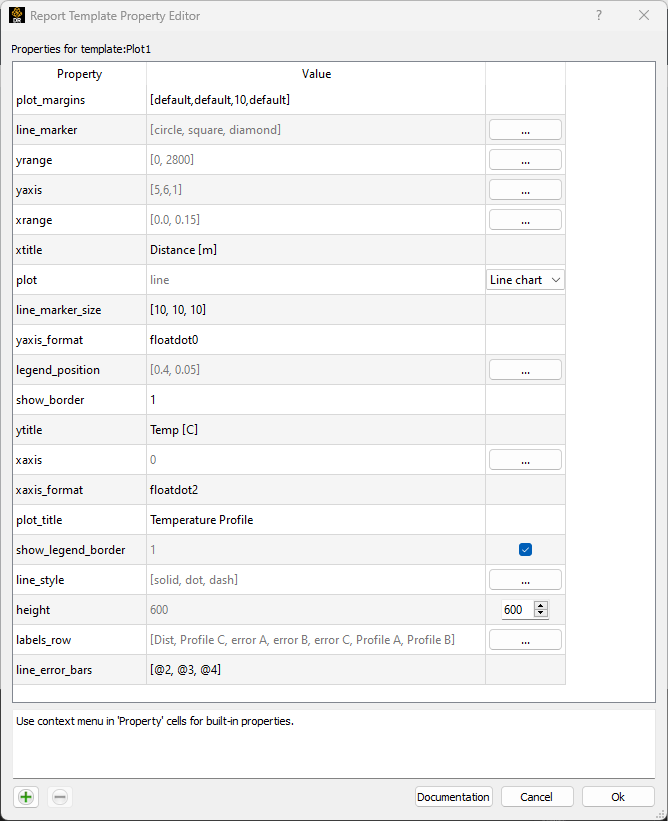
Now, it's time to set the properties so that the data will be displayed as plots. As the first thing, we need to isolate which rows to use as x ans y axis. This is done by setting xaxis and yaxis to the corresponding row indices - in this case, [0,4] and [1,5]. In this way, the first plot will be the air flow profile, the second the Force pressure profile. As a next step, we need to improve the visualization of the plots. We want the air flow profile to have only line and no dots in between the data points, and to be thicker than the normal plot. To achieve this, set the following properties:
line_color = [black, red]
plot = line
line_marker = [none, circle]
line_width = [3,1]
Now the plots are displayed as expected. You can still improve the visualization by setting the position of the legend so that it doesn't overlap your plots, setting the axis labels:
legend_position = [0.1, 0.95]
show_legend = 1
show_legend_border = 1
xtitle = Distance [m]
ytitle = Force Pressure [N]
This is the complete set of properties used to generate the gallery plot:
Plot 2: Multi-variate Scatterplot#
How to use size and color of points to display multiple variables?
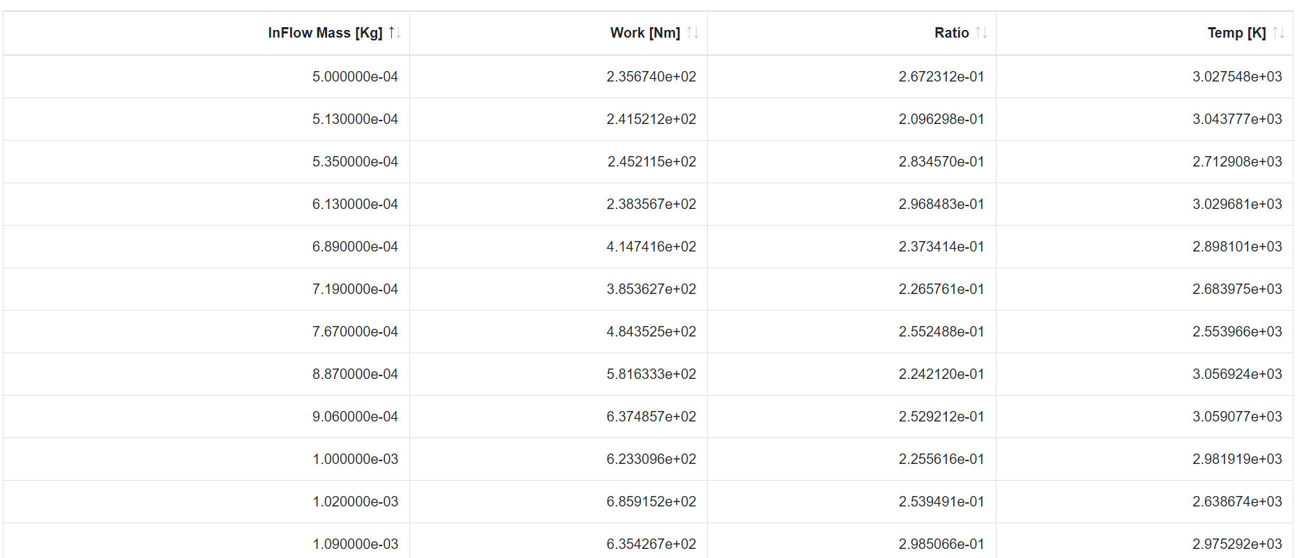
The goal of plot 2 is to display multiple variables in one single 2D visualization. The plot shows Work vs. Inflow mass, with each data point sized by the ratio of chemicals and colored according to a Temperature palette. Therefore, a total of three variables are displayed against the Inflow mass.
To obtain such visualization, the first step is to isolate the table that contains all these four parameters. Let's assume your table looks like this:
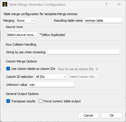
The first thing that we need to do is transpose the table so that a row corresponds to each variable (instead of a column). So, set the template type to be Table Merge Generator. In the configuration dialog, set the Merging to be Columns instead of the default Rows, and the toggle on the Transpose results:
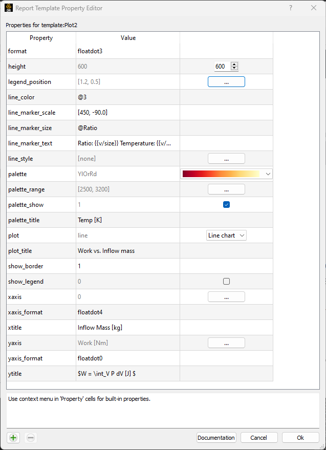
Now that we have prepared the data in the correct way, it's time to set the plot attributes. Let's open the properties editor. As a first step, the basic: set the plot, the X and Y values, and make all the data into single dots:
plot = line
xaxis = 0
xaxis_format = floatdot4
yaxis = Work [Nm]
yaxis_format = floatdot0
line_style = [none]
Next, let's use the information from Temperature to color the dots by:
line_color = @3
palette = -hot
palette_range = [2500, 3200]
palette_show = 1
palette_title = Temp [K]
And now let's use the information from Ratio to set the size of the data points:
line_marker_size = @Ratio
line_marker_scale = [450, -90.0]
We can set a text to appear when we hover over each data point, to show its values:
line_marker_text = Ratio: {{v/size}} Temperature: {{v/color}} [K]
The complete list of properties set for generating this plot is the following:
Plot 3: Multiple Queries with Error Bars#
How to display multiple queries with error bars on the same plot?
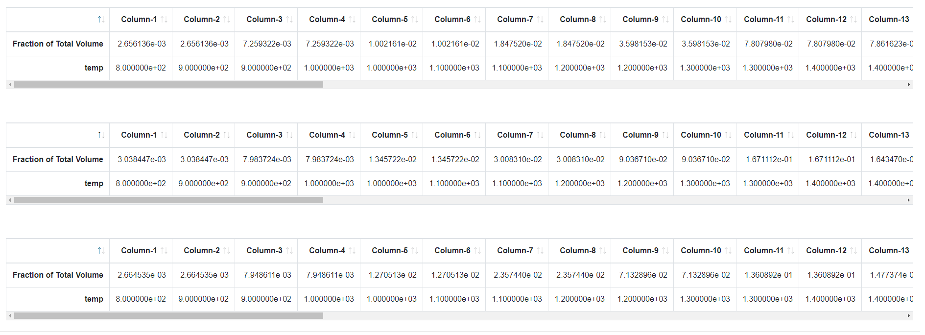
Plot 3 shows how to display multiple queries on the same plot, and also how to add error bar visualization on a query. As always, the first step is to isolate the item(s) that contain the information needed for the plot. In this case, it is a single table that looks like this:
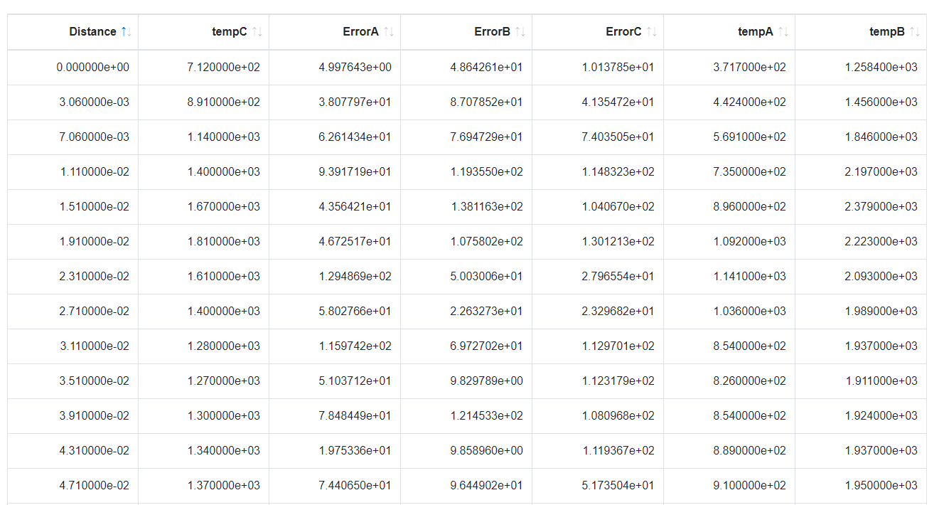
We therefore need to transpose it, so that each variable corresponds to a row. To do so, set the template type to be Table Merge Generator. In the configuration dialog, set the Merging to be Columns instead of the default Rows, and the toggle on the Transpose results:
Next step, let's set the three queries with different visualization property for each line, so to distinguish them better:
plot = line
xaxis = [0]
yaxis = [5,6,1]
line_marker = [circle, square, diamond]
line_size = [10, 10, 10]
line_style = [solid, dot, dash]
Let's add the error bar on each of the query. This is done by simply setting one property:
line_error_bars = [@2, @3, @4]
The gallery plot is generated with the following properties:
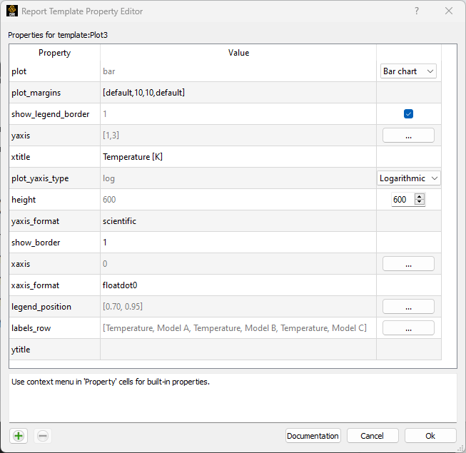
Plot 4: Grouped Bar Chart#
How to display two bar plots at the same time?
Plot 4 displays two bar plots with the same X axis. First step, as always, is to isolate the item(s) that contain the data. In this particular case, these is how the items appear:
We have three sets of queries in three different items. We need to merge them into a single item. To do so, set the template type to be Table Merge Generator, and let the configuration be the default. Then, let's set the plot properties:
plot = bar
xaxis = 0
yaxis = [1,3]
Because of the particular values of the y axis in this case, we also want to turn on the log scale on the y direction only:
plot_yaxis_type = log
This will set the two bar plots to be against the same x axis. The complete list of properties to reproduce the example of the gallery is here:
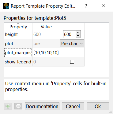
Plot 5: Simple Pie Plot#
How to display a pie plot?
The first step to display a pie plot is to isolate the table element that contains the data. Here is how it looks like:
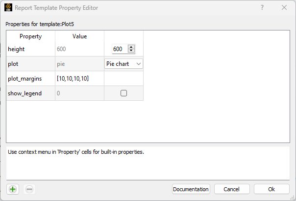
Note how the values are all in one single row, and how there is only one value for each column. Now, let's plot this as a pie chart by setting the following property:
plot = pie
That is all that is needed. If you want to reproduce exactly the chart in the gallery, these are the complete settings: